When, at a glance.
Date and time have a clear hierarchy. The calendar action sits next to the information it refers to.
Case study / CESO / 2025 → 2026
From building the website in 2025 to its 2026 redesign. I worked on development, visual identity and, above all, how people find information and use an event page, on desktop and mobile.
Explore the transformation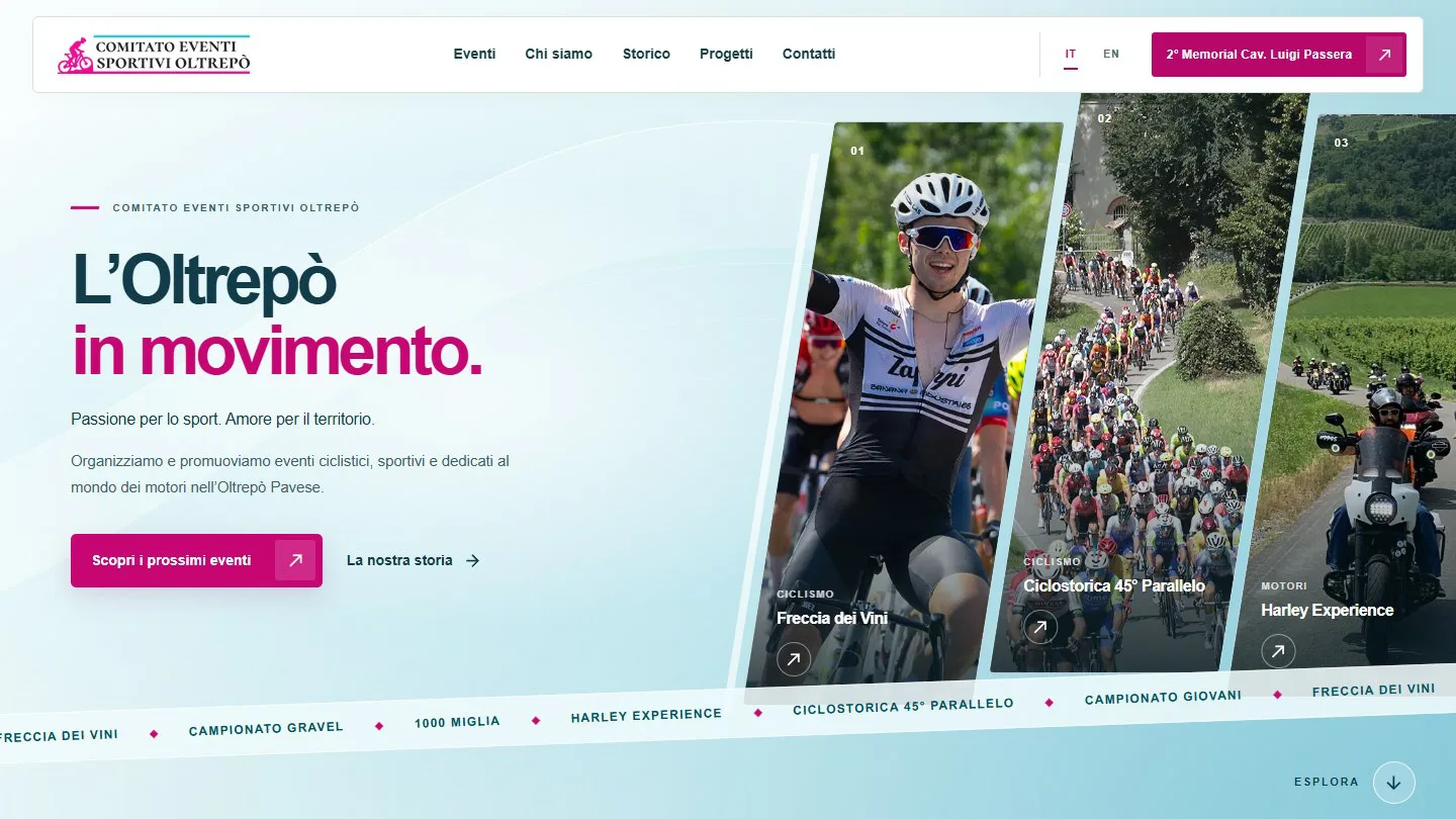
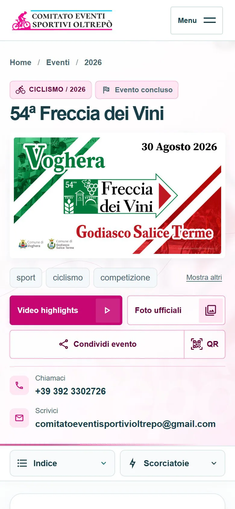
One project, from first impression to fine detail.
Redesign implemented · available as a preview
01 / The heart of the work
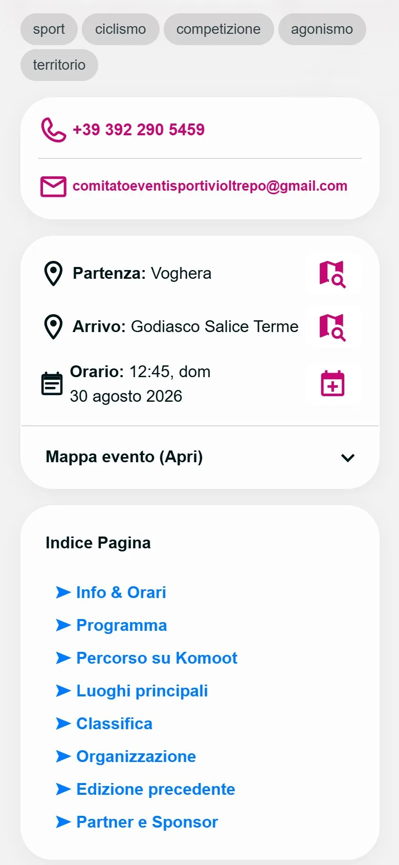
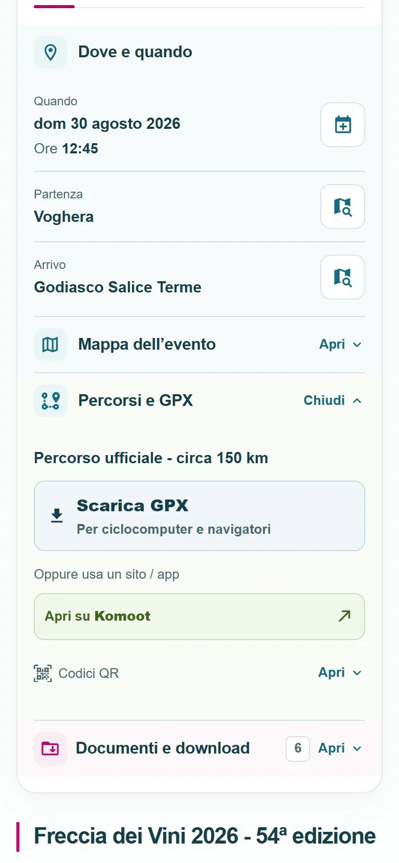
A race, an outdoor experience and a sports festival need different information. The layout needs room for the story while keeping times, locations, routes and documents within reach. Compare the real pages inside two phones, or switch to the desktop view.
The button loads both real websites right here. Scroll inside the frames, open menus and panels, and try the actions.
 Loading the page…
 Loading the page…
Date and time have a clear hierarchy. The calendar action sits next to the information it refers to.
Start and finish remain readable with the map closed. Each location can be opened in Maps.
GPX for a navigation device or Komoot to explore: the choices are explicit. Panels keep the tools together.
Freccia dei Vini / a closer look at the tools. Numbered callouts connect UX decisions to the elements in the screenshot.On desktop: index on the left, story in the centre, tools on the right. Information and actions accompany the reading.
Italian screenshots from 25 September 2026. Live sites may change; in English they open the EN version. If a page does not load inside its frame, open it in a separate tab.
The index follows the story. Shortcuts lead to practical resources: distinct routes for people exploring and those who already know what they need.
Dates and locations remain available with the map closed. Routes and documents expand on demand; shortcuts open the relevant panel.
Open a location in Maps, add a date to a calendar, view a document or download a GPX: actions follow the materials available for each event.
02 / A change in scale
The history page already existed in my website. The redesign changes its presentation dramatically: years, events, images and a visual path build a richer narrative. The desktop comparison makes this transformation clear; the work also covered smooth scrolling on smartphones.
Three internal views of the same year in both versions. Each screenshot appears in full, without additional cropping; activate the real sites to explore the entire page.
The button loads both real websites right here. Scroll inside the frames, open menus and panels, and try the actions.
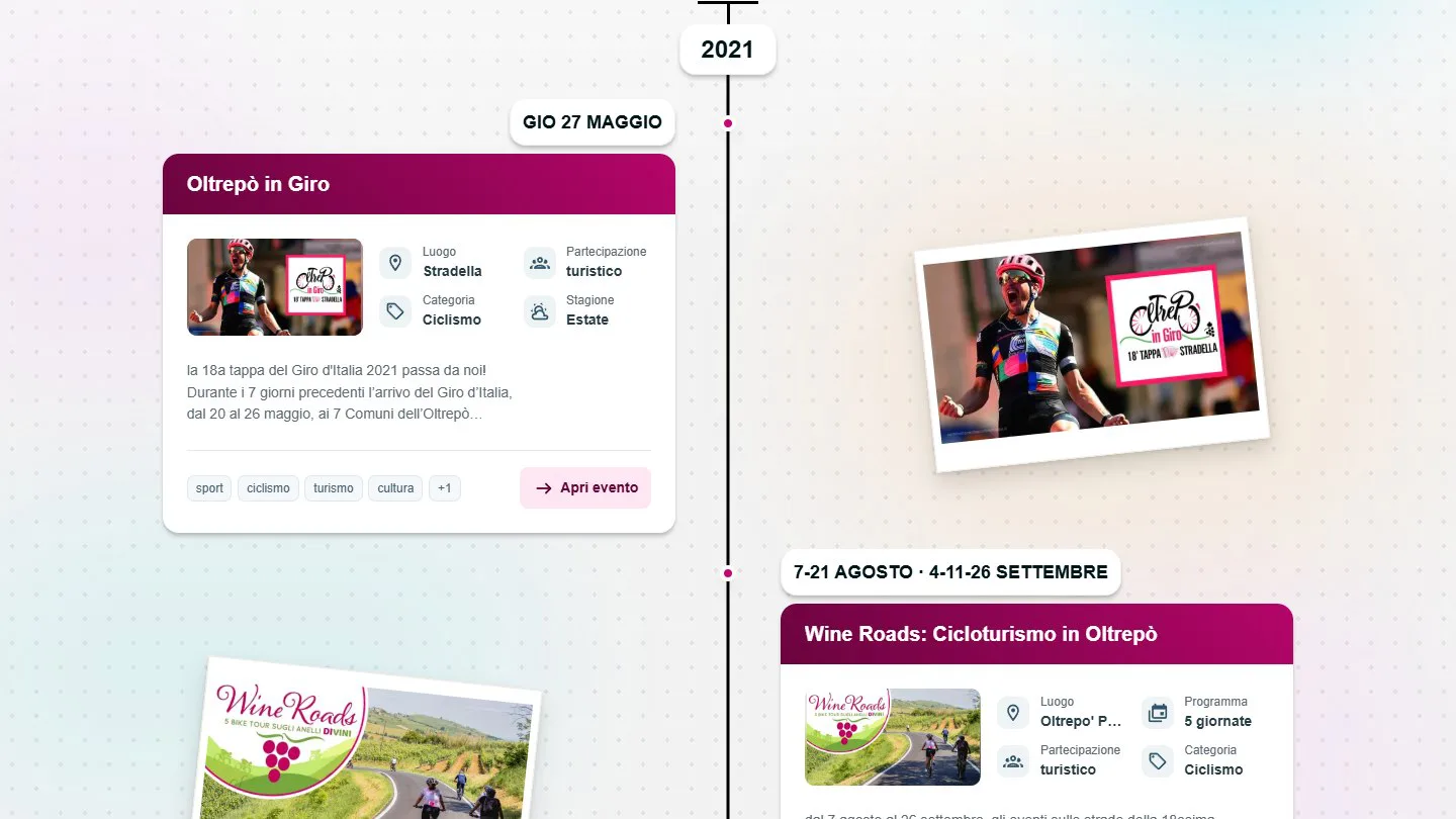 Loading the page…
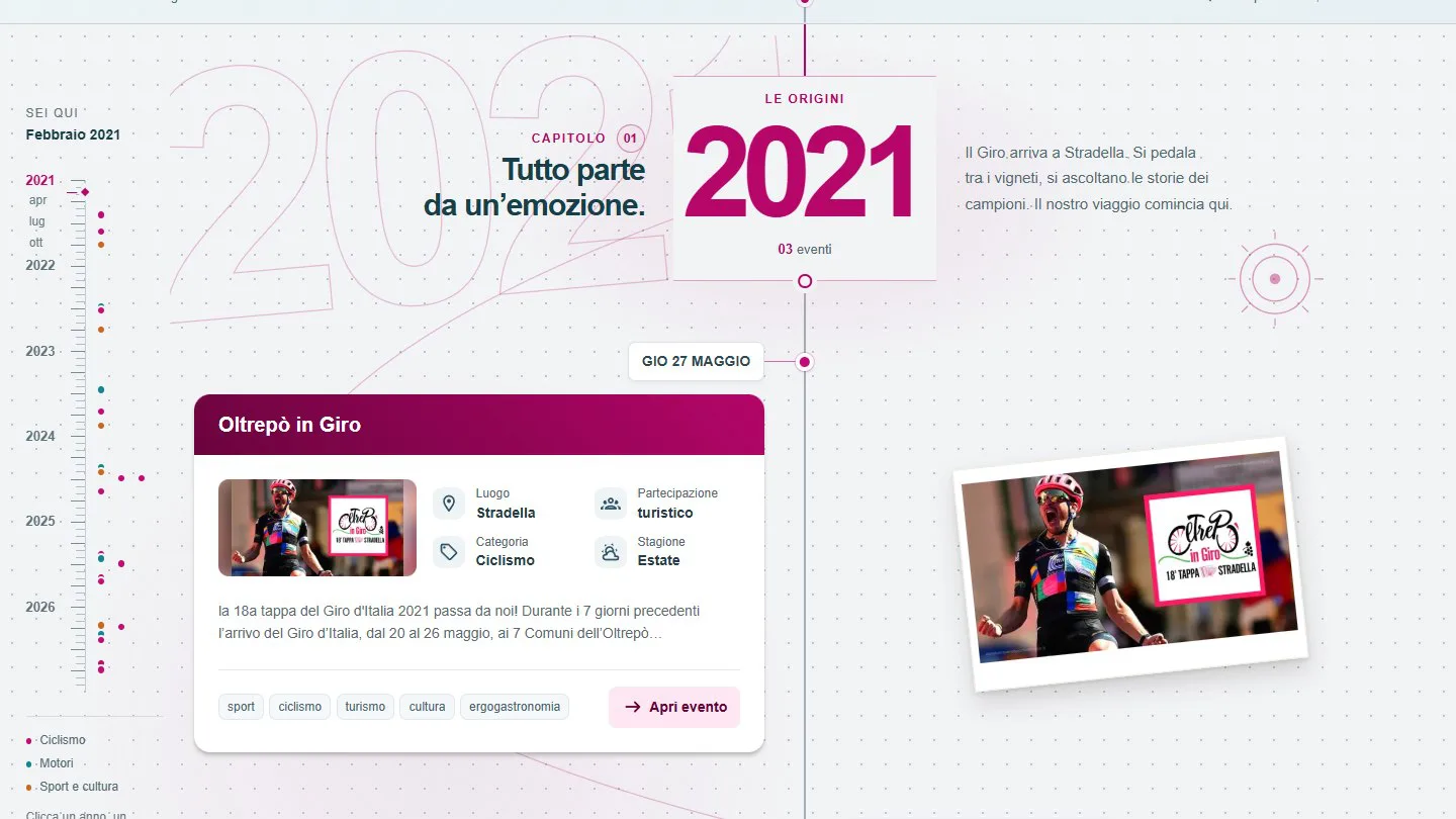 Loading the page…
Italian screenshots from 25 September 2026. Live sites may change; in English they open the EN version. If a page does not load inside its frame, open it in a separate tab.
03 / A more considered identity
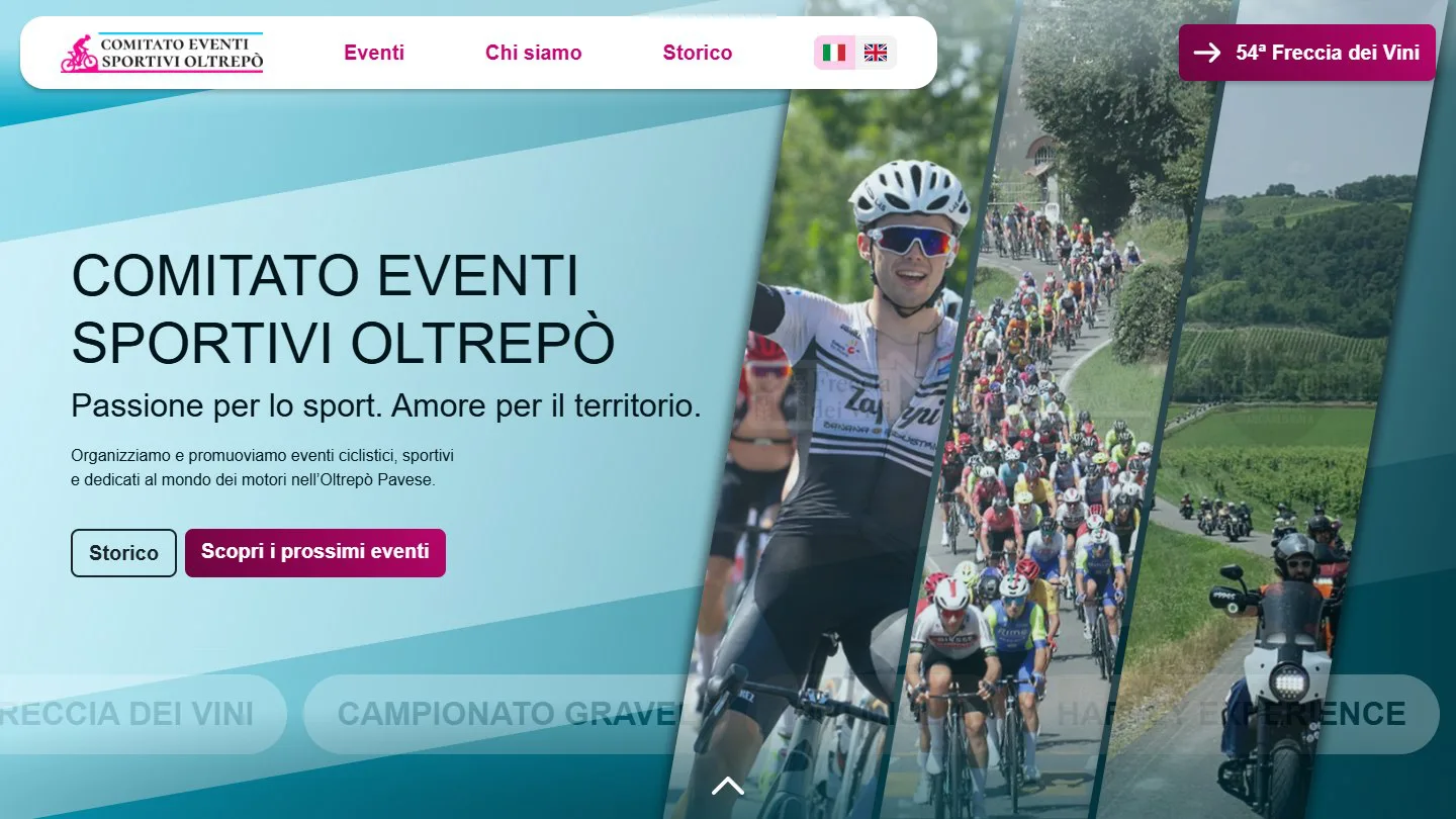
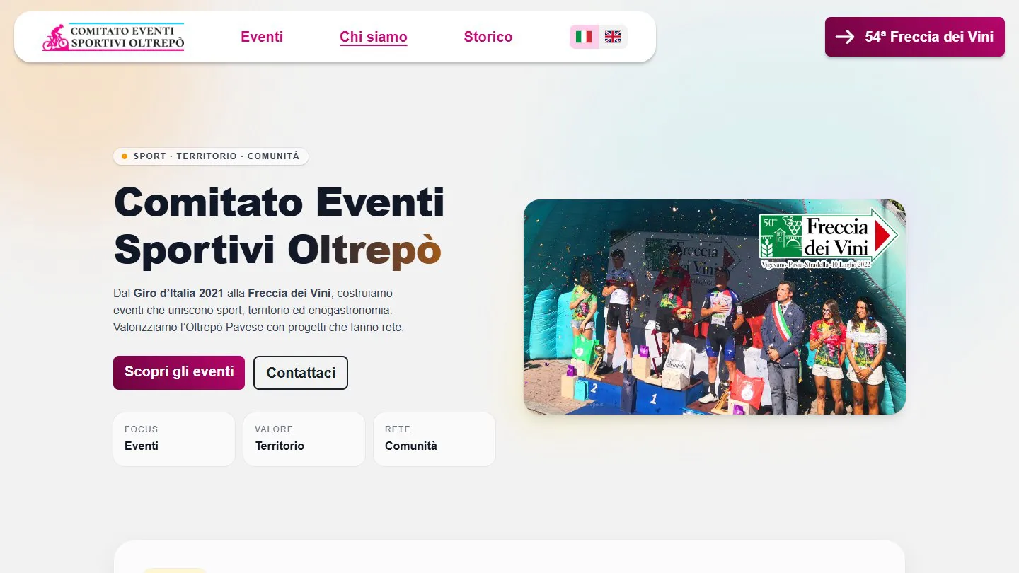
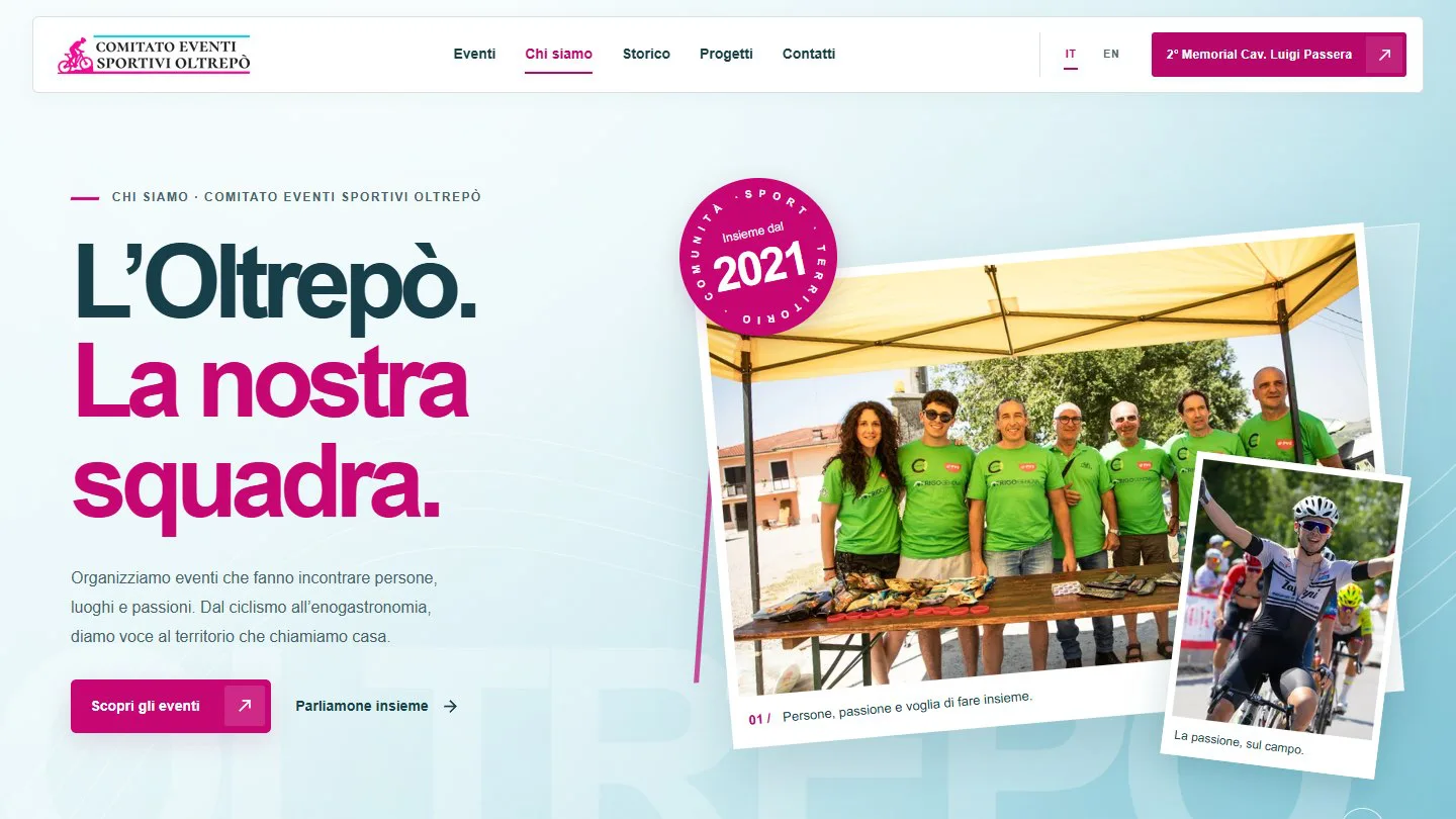
For Home and About, the main change is visual: typography, spacing, image composition and consistency between pages. The aim is a more professional, recognisable presence for the committee.
The main message has more room. Images, the calendar and event entry points establish a clearer visual rhythm.
History, values and support for sport gain a more intentional composition, consistent with the new identity.
04 / A space that was missing
I added a Projects section from scratch: a catalogue and dedicated pages for initiatives and commitments that continue beyond an individual event. The dedicated space is new; some content, such as support for show jumping, already existed elsewhere on the site.
Before: no dedicated Projects section
Explore the Projects section ↗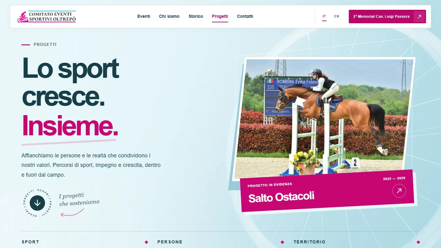
05 / Behind the scenes
In 2025 I built the new website and integrated the previous domain, handling client requirements, publishing and maintenance. I also created Photoshop posters and versions for the website and social media. In 2026 I implemented functional improvements, a visual redesign and changes to part of the architecture.
Three needs, one project
I worked on finding events, preparing to take part and revisiting their history. The 2026 redesign takes this journey further, down to the details of each event page.
On the previous website, managed by another company, past events disappeared from the listing. I built a dedicated archive in my website: text search, year and category filters, a list and an interactive map.
The same results can be explored as cards or map markers, with links to the individual events.
Explore the calendar and archiveI created a History page separate from the calendar: a timeline of events, images and links telling the story of the committee’s development and its ongoing work in the local area.
In the redesign, navigation by year and a visual path guide the story, with particular attention to smooth scrolling on phones.
Explore the historyFor the redesign, I refined the UI and UX of event pages on desktop and mobile: content hierarchy, actions and resources relevant to each event, from races to local outings and gatherings.
Dates, locations and contacts remain within reach; schedules, routes, registration and results appear when available.
See the UI and UX decisionsThe archive and history are part of the evolution of the website I built in 2025. Links open the implemented 2026 redesign in a new tab, available on the preview subdomain and not yet active on the main domain.
From user needs to interface decisions
I used this question to organise access to information while preserving the original story and resources. A race, an outing and a sports festival call for different information.
Timings, start and finish locations, the route and race documents. Previous editions remain linked, with results and resources where available.
Open the event page Freccia dei ViniHow to take part, where to meet, which route to choose and GPX tracks. FAQs and practical guidance help visitors prepare for the outing.
Open the event page Anello DiVinoThe programme, venues, activities and guests. The page highlights information that helps visitors decide when to arrive and which sessions to attend.
Open the event page Festa dello SportThese decisions document the work and its usability goals. They are not associated with measured increases in traffic, registrations or sponsorships.
Event data and IT/EN text compose the layouts. Languages share assets; programme, routes and documents follow the available content.
The previous edition’s title, year and cover are resolved from the catalogue. Unknown references, self references and invalid dates cause explicit build errors.
Without a cover, the previous edition remains a text card. Components, operational guides and dedicated tests support maintenance.
Before and after compare two 2026 versions of my website. The site preceding my involvement was managed by another company. The redesign is implemented and available as a preview; the main domain still serves the previous version. The 25 September 2026 captures reused some assets between revisions: they are not complete historical copies and do not demonstrate measured traffic or conversion gains.
The 24 May 2022 Wayback capture records the old domain. It is not the visual baseline for the 2026 redesign.
Open the Wayback Machine capture ↗